
E45
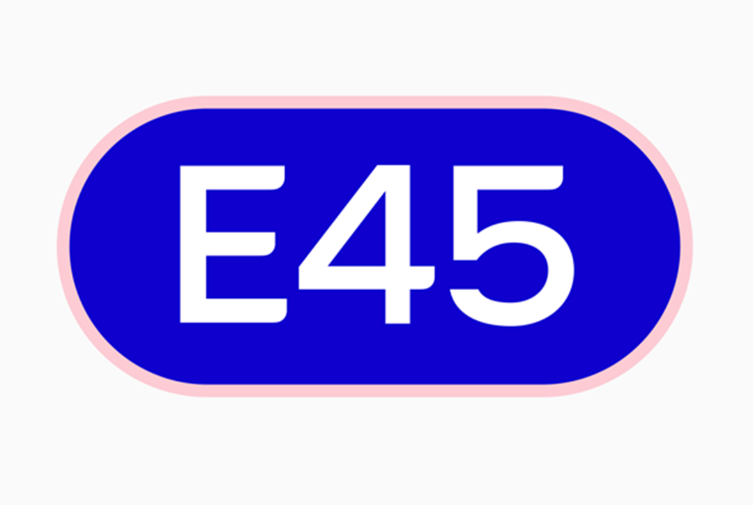
I worked with Elmwood on the initial animation principles for the E45 rebrand. It centered around the concept of skin cells using a horizontal capsule shape to illustrate them. It also encapsulated the E45 logo and other text. The logo can be seen below; the ripples almost referencing a finger print:
The video below was an exploration of where the motion principles could go, with the skin cells building up like walls. Also skin cells interacting so that they never fully collide, but softly form around each other:
The animation below was a concept for a digital billboard advert in portrait. The ‘capsule skin cells’ bump into each other a lot more than the video above. They also deform and wobble more on impact. Ultimately this kind of movement was toned down a lot so that the deformation had much less ripple. There was more of a visible gap between the ‘cells’ than can be seen here in this early test state:
Selected Works
















Email: Contact@dbvfx.com