
Dolmio
I was pleased to have helped Elmwood develop the Dolmio rebrand animations.
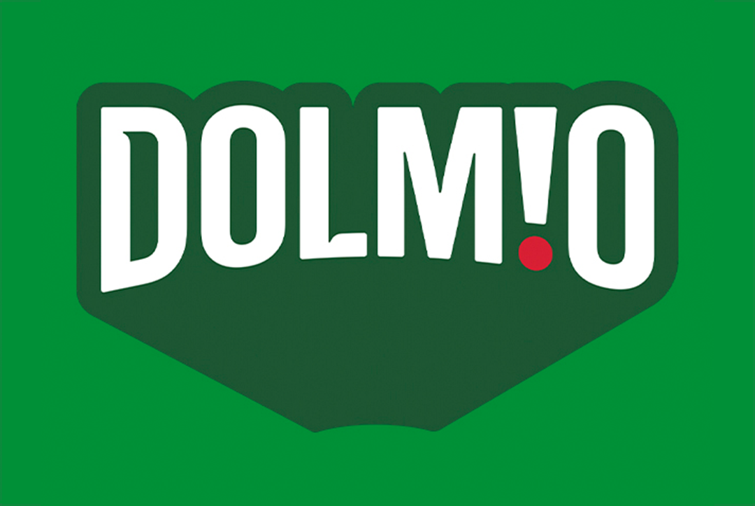
Initially there were a few lockup styles to explore, the final one ended up being something that drew inspiration from the lettering used in the Netflix logo. Early ideas for movement can be seen here. This was before it was refined and given the green outline with the look of extruded depth:
These two variations use the ‘Pop’ of the Dolmio jar at it's opened, which was used as a signature sound:
Other design routes explored can be seen here. This first one has just a single subtle difference, which is the tomato acting as the dot over the ‘i’, either gently landing into place or scaling up from nothing:
This route has versions with variable text morphing; an overall deformation ‘squishing’ the text, and another with the letters spinning around the orbit of the ‘O’:
This third route was to aim for the desgin lockup to look like the sauce was poured out. The difference being the splash flying in from the bottom right hand corner, or emerging from a point already on the screen:
This last route has the wordmark building from either a sequential scale up of each letter, or the characters being drawn on, and emerging bit by bit:
Ideas for 'Tasty New Look' can be seen here:
'Tasty New Look' with the final extruded outline look, animating on from what feels like the far distance can be seen here:
The final logo and ‘sonic’ can be seen and heard here, using the ‘i dot’ as a device to hit the syllables of the word ‘Dolmio’:
Selected Works
Email: Contact@dbvfx.com